ClassPass
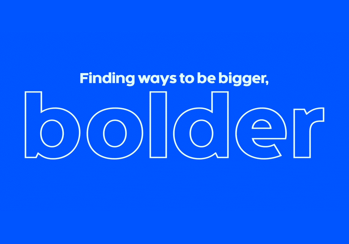
After five years and millions of workouts, ClassPass originally launched to give people an easy way to book studio fitness classes. Over time, they evolved what fitness means. It can be fun, it can travel with you, it can create new friendships, it will be there every step of your journey.
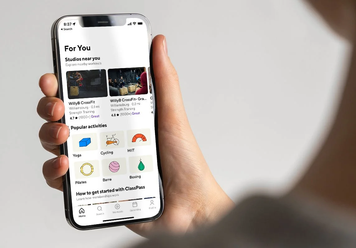
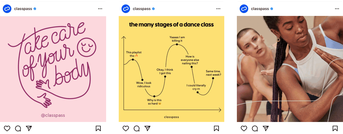
My role as lead designer was to design the logo and design system encompassing the updated core values and how it expresses itself throughout marketing and product. In order to meet the needs of our web and mobile platforms, I worked closely with the product design team to create the type, color and UI system to accomodate for their growing needs and its implementation into the product.
ROLE
Logo Design
Design System
Product Implementation
COLLABORATORS
Creative Director:
Greg Hathaway
Animation:
Jane Mcdonough
Copywriter:
Hannah Baker
Product Designer:
Tom Germeau
Typographer:
Triboro

THE MONOGRAM
The new logo takes on the shape of an oval that curves in the middle like it’s rippling in water and to create the monogram “CP”. The dynamic nature to it that inspires action and motion. And that’s exactly what the brand does. It’s an app for people to get motivated and to workout.