ClassPass Landing Page Optimizations
Prior to a major advertising spend ClassPass was looking to optimize the homepage in order to maximize free trial sign-ups. Furthermore, after a successful rebrand, I was tasked to figure out how to pair this optimization with infusing our new brand onto the page. The goal was to increase conversions from the homepage by 10%.
ROLE
Strategy
Wireframing
Prototyping
User Testing
UI Design
Dev Handoff
COLLABORATORS
Copywriter:
Tatiana Kuzmowicz
Product Manager:
Megan Magrew
Researcher:
Key Lee

Constraints
Work is only to be done on the landing page and not subsequent pages
Work and research needs to be completed in 2, single week sprints
Testing should be done on desktop
Brutalism vs. Beauty
When users were sent to landing pages, the data showed that the top version of the hero module, of an image of a vague map, outperformed the below version of a highly art directed image of a woman performing a yoga pose.
An important goal was to figure out how might we use brand imagery to in a perfomant way to represent ClassPass in the hero image.

Preliminary Research
I began with an audit of the current flow to begin to put myself into the user’s shoes. Starting from a social ad, to a landing page, to a trial landing page, users have the opportunity to learn more about the service as they are led through the experience.

Existing Data
Quantitative
50% visit via mobile 50% on desktop
“Get ClassPass” button in the sticky nav used the most vs clicking on the hero CTA
Qualitative
Ran tests with 5 users on usertesting.com
Users are most interested in commiting after they know what is in their area
General confusion around how credits work
They like the idea of being able to workout from home

Competitive Research
Looked at competitors and high performing subscription services to see if there were any patterns. What I found was, while each service had their own method, they all prioritized their greatest benefit in the hero module, followed by showing variety and how their service could be accessed on any device.

Phase I:
Workshopping Hero Modules
I then held a workshop with the product team and key stakeholders to align around what ideas were to be tested. This allowed for a comprehensive look at assumptions and allowed everyone voices to be heard.
We isolated the testing around three buckets, image creative, copy focus and features if any.

High Fidelity Mocks
After understanding all the different combinations of content types, we isolated five different types of hero modules that felt good to test against our original hero modules.
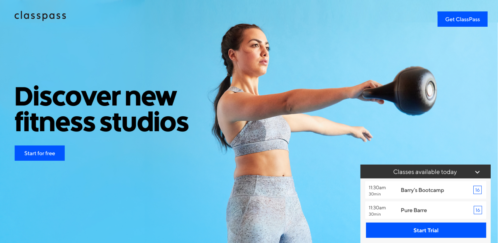
Photo studio image, short headline, no subhead with class module
Fitness studio Image, long headline, and studio peak
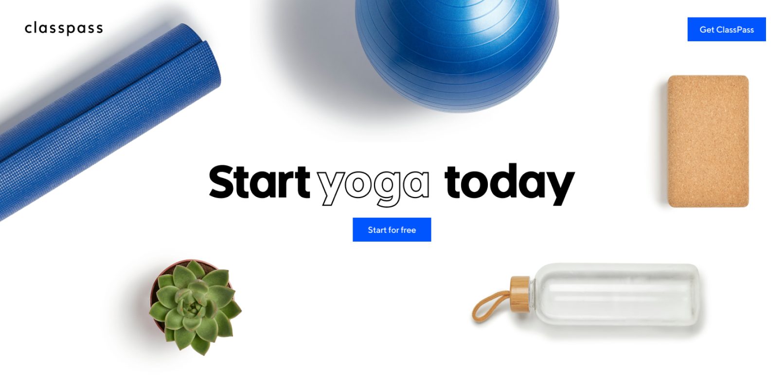
Fitness studio Image with form
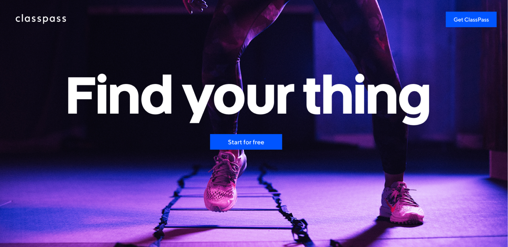
Intense image with short headline
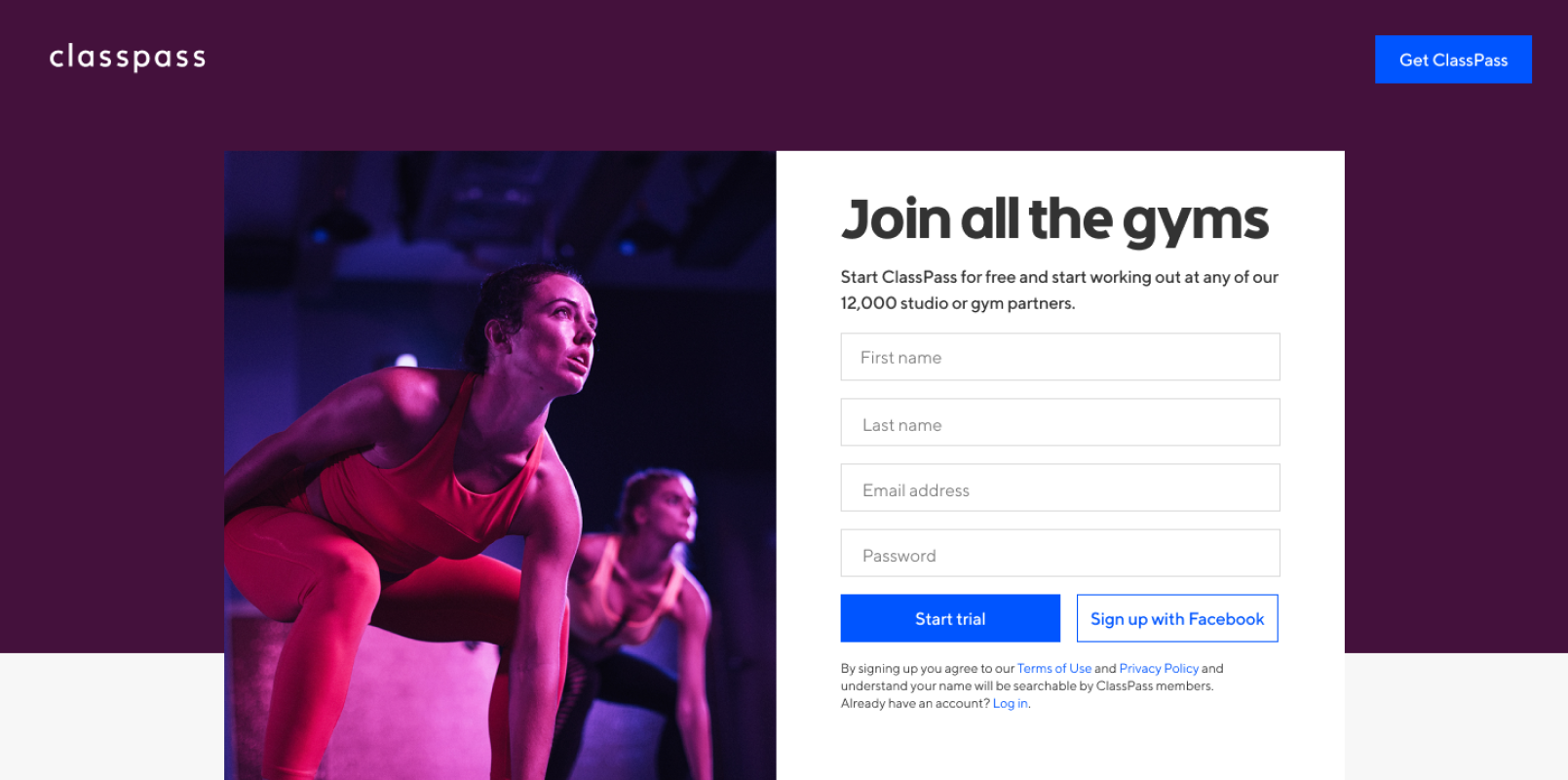
Image carousel of different fitness items/no subhead
Testing Methodology
Worked with User Research team to create prototypes and testing script
10 people on usertesting.com
Live in a medium or large city
Experience with group fitness
Never had a ClassPass membership
Tested on desktop
Testing journey
ClassPass ad on Facebook
Randomized hero images including original hero module
Talk about each option
Choose their favorite

Testing Results

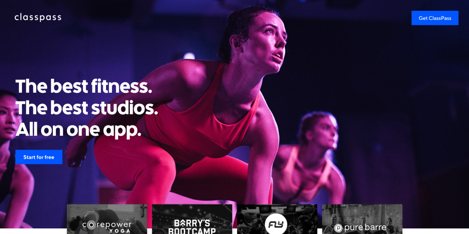
Winning Concept
Users overwhelmingly liked the carousel of fitness items carousel
The movement was eye catching
They liked explicitly understanding what types of workouts they can do on the platform
Through visuals and succinct copy, users were able to tell us what ClassPass is within the first few seconds
Additional Observations
Users tended to be polarized by intense fitness imagery or calming imagery - it suited their needs or it didn’t
Introducing the classes module with credits was immediately confusing - was that how much they cost?
Asking people fill out the form felt pushy
Seeing the studio partners was a close second in favorite
Overall, in fitness studio was perferred over photo studio imagery

Phase II:
Subsequent Content Modules
Reassembling the stakeholder and product team for a second workshop it was time to make assumptions and test the rest of the content on the page. Using benchmarking data from the competitive research, we aligned on content that felt important, but created three different lengths of pages in order to find the sweet spot.

High Fidelity Mocks
Once we were satisfied with the general content, I partnered with copy, to create high fidelity mocks. After a round of feedback from the team we were ready to test with users.

Testing Methodology
We ran a very similar test to Phase I. It worked like this:
Worked with User Research team to create prototypes and testing script
10 people on usertesting.com
Live in a medium or large city
Experience with group fitness
Never had a ClassPass membership
Tested on desktop
Testing journey
ClassPass ad on Facebook
Randomized landing pages including original hero module
Talk about each option
Choose their favorite

Testing Results
The medium version felt the best. Users felt that the sequence of information lent itself to the most natural flow of information. The small version felt too short, leaving users with a lot of questions, where the large version felt confusing and complicated.
Additiona Observations - Imagery
Diversity and inclusivity matters!
When users were presented with images of people who were of different genders, body shapes, and races they reacted very positively.
If they don’t find someone they can identify with on the page, the product feels less like it is for them.


Additional Observations - Value props
Making value props easily scannable is really important.
After a prospective user understands what our service is, following up with the quick understanding of how it is valuable to them is the 1-2 punch.
Takeaways and Next Steps
After this round of feedback we were able to gather a number of insights. We chose to take these insights and now apply them to the current homepage. Before investing in expensive engineering in new modules, we wanted to use what we currently had to see if we could create the desired lift.
We chose to combine our insights in the hero module, using many different class and user types in a collage.
We then picked four of the most resonant modules to follow the hero module.
We were able to reach our 10% lift in sign ups and never had to see the ugly map image again.
